Table of Contents
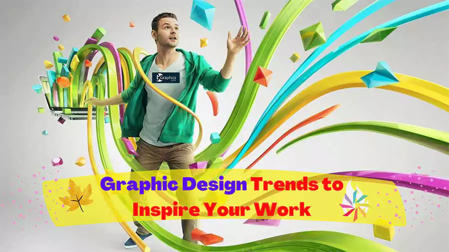
Inspiration from graphic design trends may be useful to a variety of different people, not only designers. Knowing what designers are producing may also be helpful for marketers, product managers, and sales teams since it provides them with useful insight for their jobs.
Collaboration across different teams can also profit from the exchange of ideas and knowledge, such as the most exciting trends in graphic design for the year 2024.
We’ve compiled 9 of the most compelling examples of current trends in graphic design to serve as a source of motivation for you and your team as you plan and develop new products, projects, and ideas.
What Are We Waiting For? Let’s Find Graphic Design Trends
Here we are gonna talk about such graphic design trends of 2024
01. Embracing Difference and Including Everyone
Inclusion and diversity are the single most significant trends in graphic design, and it is gradually transitioning from being a trend to being more of a permanent fixture year after year. The fact that it is still a trend indicates that there is a considerable distance to travel in this respect.
The most notable trend is that both stock photographs and depictions of individuals now include a wider range of ethnicities and sexual orientations.
The illustration below shows the design of the packaging for a sunscreen that was created specifically for people of varying skin tones. This is a more prominent example than the one before.
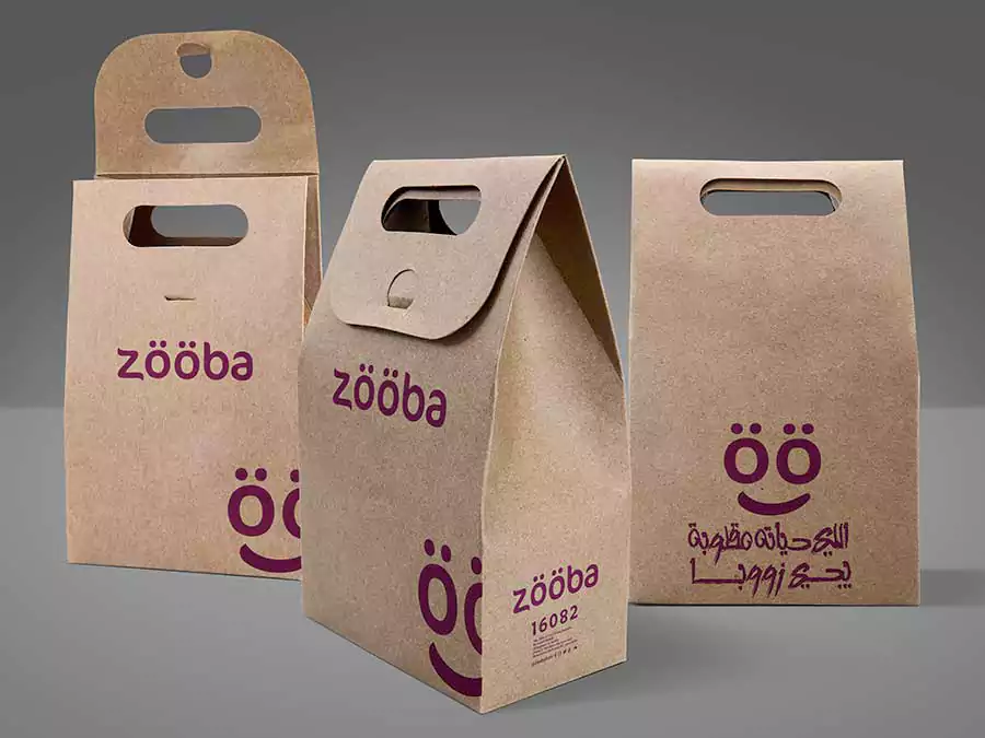
The color of the bottle’s skin corresponds to the color of the formulation of the substance that it holds. Not only are they varied, but they are also environmentally friendly because the papers used in their construction are recycled.
Although this item is not currently for sale, the idea behind its design has been generating a lot of buzz recently.
The Adidas Mother’s Day commercial showcased moms of all races, shapes, and in diverse day-to-day exercising circumstances. In all the situations, the children are part of the composition, from baby-wearing to youngsters jogging beside the mom. This sort of graphic advertising is what we should be seeing more of.
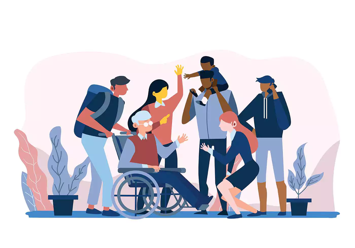
Another evidence of this pattern may be seen in the example below. Although there is just one sort of skin tone, many body types and limitations can be deduced from its appearance.
The portrayal of disabled persons in pictures such as these is extremely rare; nevertheless, we are pleased to see that this is beginning to change.
02. Minimalist Data Visualizations
The next trend in graphic design that we have observed and are pretty excited about is data visualization which uses a minimalistic approach.
These are layouts that were developed with a single data set in the most visually appealing way that was possible. The method of visualizing information may take the form of anything from an infographic artwork to a line chart. In order for the design to be successful, it must not be overly difficult and the spectator must be able to comprehend the information immediately.
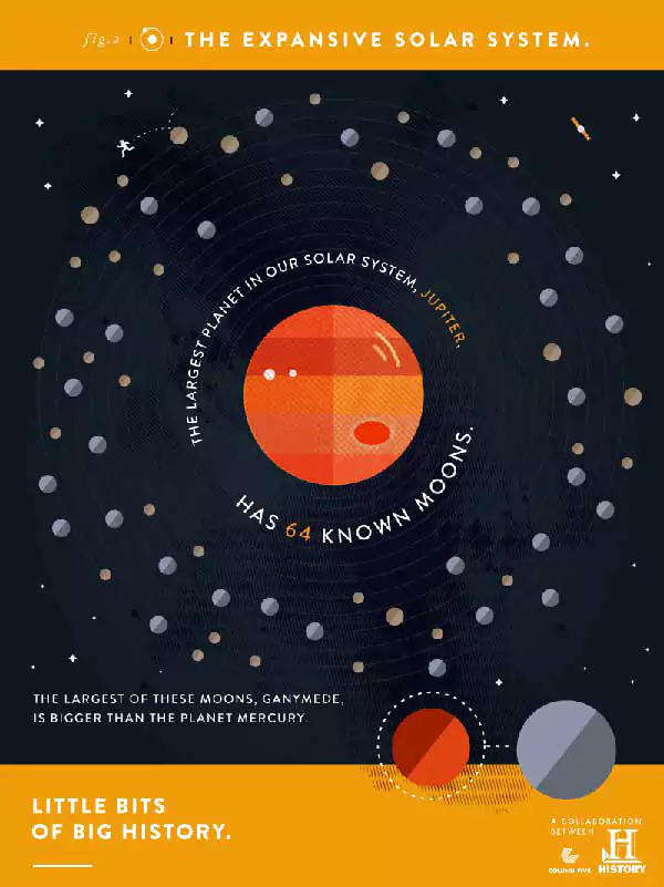
The following data visualization is part of a larger series that has been titled Little Bits of Big History. In this particular instance, the data pertains to the sixty-four moons that orbit Jupiter, and specifically, the fact that Ganymede, the largest of these moons, is larger than the planet Mercury.
The depiction of the concept is accomplished through the use of infographics in the following example, which was provided by Column Five Media and The History Channel.
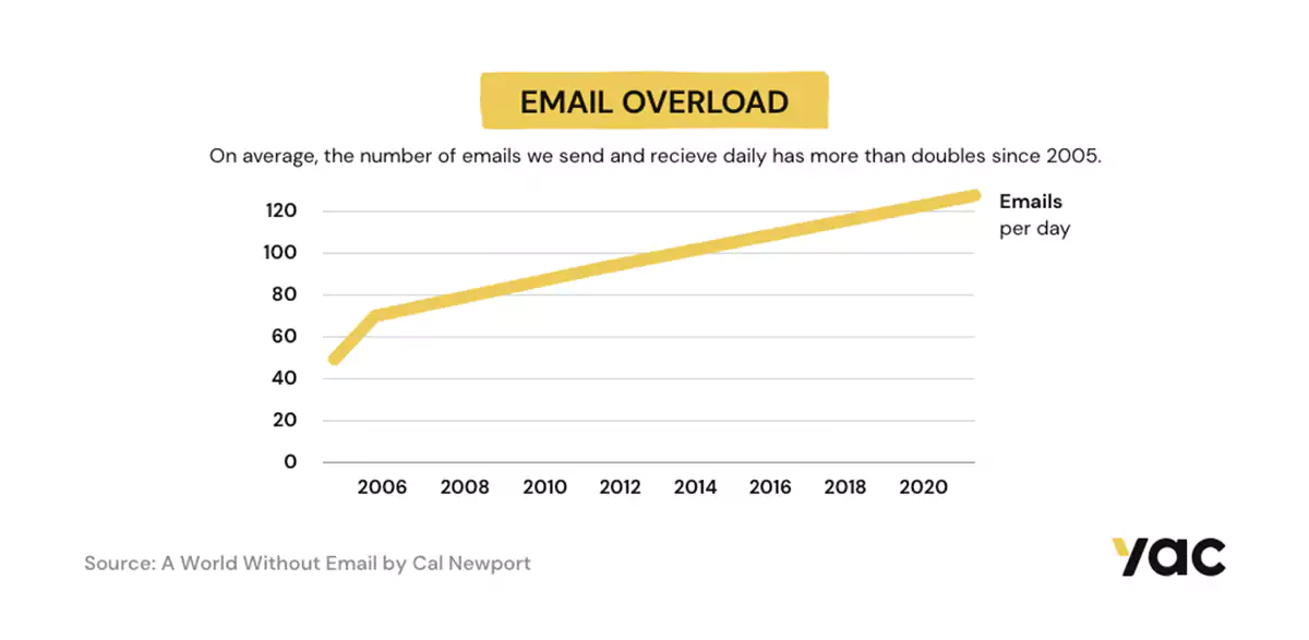
One additional illustration, this one leaning closer toward the traditional style, is a straightforward line chart. One key distinction is that the yellow lines have the appearance of a highlighter.
This seemingly insignificant aspect is what distinguishes this line chart from other line charts that only have a thin line. Your blog entries will benefit greatly from the addition of these data visualizations with a basic design.
Visme offers one last data visualization example in the form of this simple template. The data is presented in the form of a statement that is backed up by a donut chart that is colored differently than the background.
These kinds of graphics can be easily modified or created from scratch due to their user-friendly nature. They also make it very simple to share content across many social media platforms. What exactly are you waiting for to begin utilizing them?
Related Article- Graphic Design vs UX Design
03. Facebook & Twitter Carousels
Carousels on social media are not even close to being a novel concept at this point. Gary Vaynerchuk has been producing these for many years! An example of one of the most recent social media carousels that he has put on LinkedIn can be found below. However, Chris Do’s social media carousels were the ones to start the trend wave that was started by his style.
Chris Do, a well-known and highly regarded designer, is someone who has been an inspiration to hundreds of thousands, if not millions, of other designers all over the world. His organization, The Future, provides training and resources for designers who want to further their careers in the industry but lack the Chris Accomplish magic required to do it.
Chris Do has, for some time now, been using his Instagram account to provide social media carousels that offer design advice. You may see an example of a social media carousel created by Chris Do — The Future below.
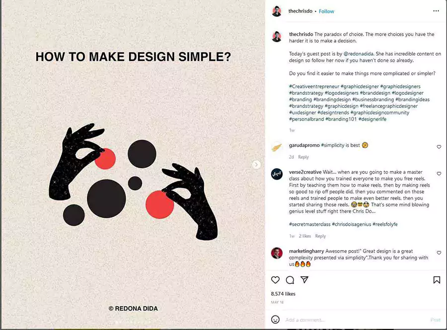
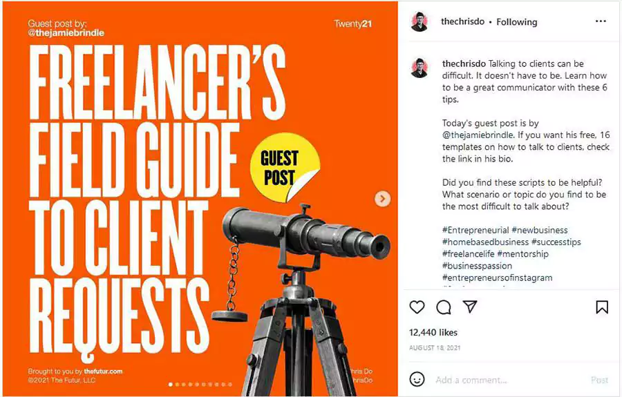
This wasn’t long until hundreds or perhaps thousands of content creators began flooding Instagram and LinkedIn with social media carousels that employ the same typeface and style as the Chris Do carousels.
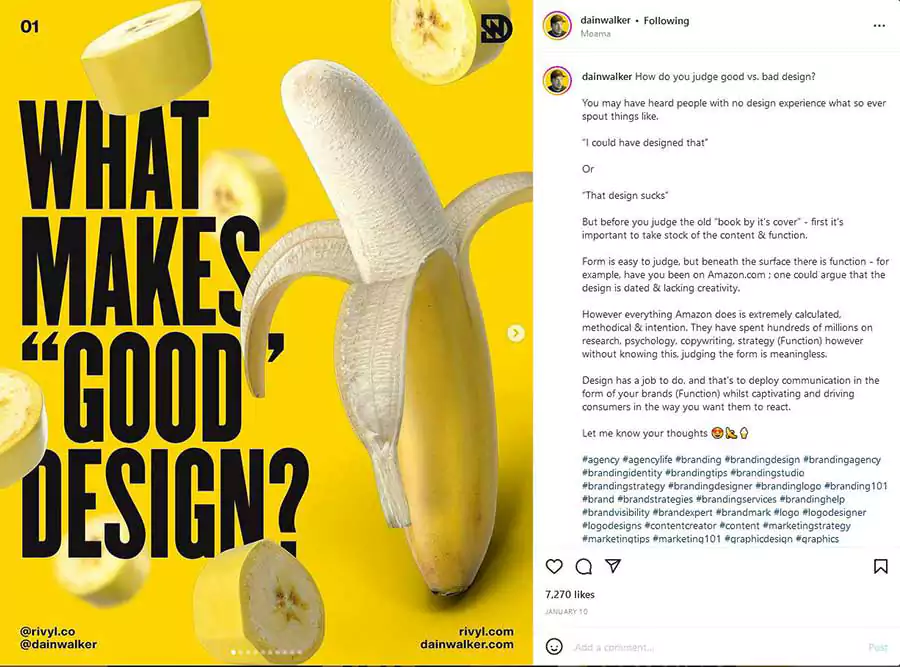
These carousels were inspired by Chris Do’s carousels. It does not appear that this tendency will end any time soon; nonetheless, we have observed a gradual increase in styles that are distinct from the traditional Chris Do.
04. Compositions of Flat Geometric Shapes
Another element of design that is neither fresh nor original is geometry, but the use of geometry in innovative and interesting ways is becoming increasingly popular. The utilization of flat geometric compositions in branding strategies has caused noteworthy waves, and the utilization of geometric shapes in all of the brand’s assets has contributed to this.
Although not every piece of collateral makes use of the composition in the same manner, those that do are consistent with one another and don’t feel out of place. The challenge here is to develop a modular, geometric design system that can be copied and modified for use with a variety of assets.
Consider, for instance, the branded assets listed below. Although the patterns of the lanyards and the bus stops appear to be different at first glance, a connection can be made between the two by observing the forms, colors, and how they are slanted against one another.
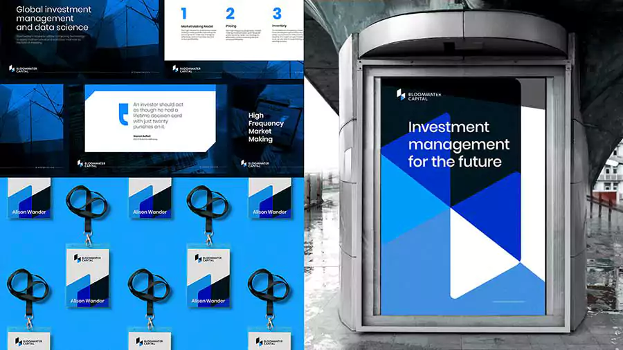
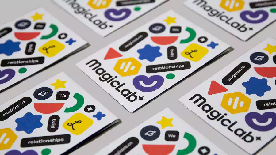
Flat geometric forms may be as a business or as playful as the designer wants to make them. The business card design below combines geometric designs that are colorful and vivid. Even though they appear as if they could be in a shamble, they’re really purposefully arranged so that the spectator can read “We Build Relationships.”
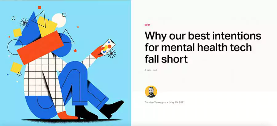
Buffer is another company that has, and continues to employ, a variety of geometric shapes in its branding. One may claim that they are the ones responsible for starting this trend. Although their geometric designs tend to be less precise and more scribbly, they nonetheless manage to produce striking effects when combined with photographs.
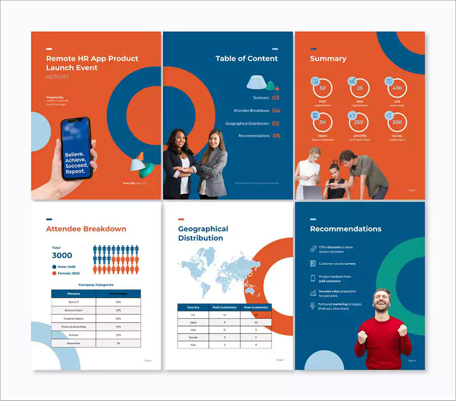
The following Visme template, which is intended to be used for a report on an event, makes use of widgets that illustrate essential aspects and employ flat geometric forms as backdrop components. Your Visme dashboard will provide you with a large number of flat geometric forms that you may use in your fashionable creations.
05. Biodiversity and Environmental Stewardship
The fact that environmentally conscious and nature-inspired design is still a growing trend indicates that we still have a long way to go in addressing issues of diversity and inclusion. This design approach needs to become the standard rather than a fad.
Now that we’ve gotten that out of the way, let’s take a look at some of the current design and sustainability trends.
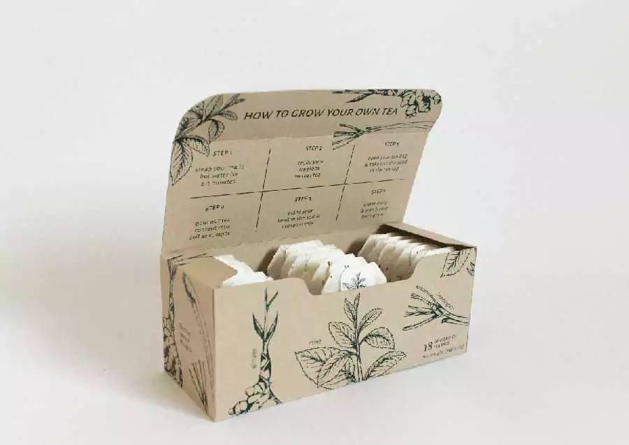
The notion of tea packaging that is detailed below extends beyond the use of recyclable materials and tea bags that have not been breached.
After consuming the tea, the seed is meant to be planted according to the directions that are included in each bag. It is cutting-edge, it engages the audience, and it has an effect.
The movement toward sustainability and the natural world does not only refer to the kind of packaging that is used for a product to make it environmentally friendly. This trend is also about the influence that brands may have via their stories.
For instance, the following infographic from Lavazza provides a visual representation of how the firm collaborates directly with coffee producers to combat the effects of climate change.
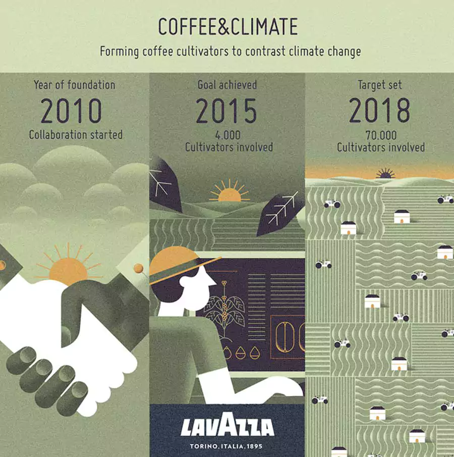
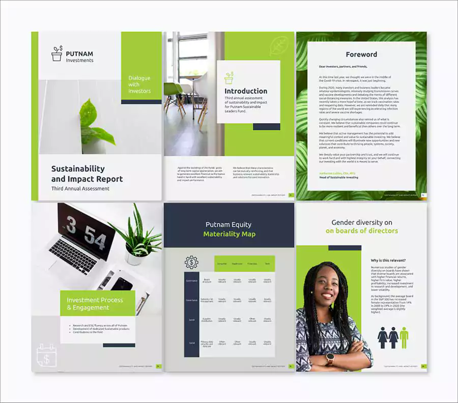
The template for a white paper that can be seen below is ideal for businesses that are making significant efforts to improve their influence on the environment and sustainability. Utilize textures such as those shown in the Lavazza infographic that is located above for an enhanced “natural” feel.
Share the final white paper in the form of a live link rather than as a printed copy to demonstrate how your business is working to reduce its impact on the environment.
06. Extraordinary Mixture in Typography
The trend of focusing on typography will be the next one on our list of innovative approaches to graphic design. What we are witnessing is a new way to employ letters and typefaces, an approach that is more free-spirited and whimsical than others that came before it and does not resemble any of those approaches.
This is a fantastic chance for companies to differentiate themselves from their competitors and stand out from the crowd; yet, doing this requires striking the correct balance between the letterforms and colors that are employed.
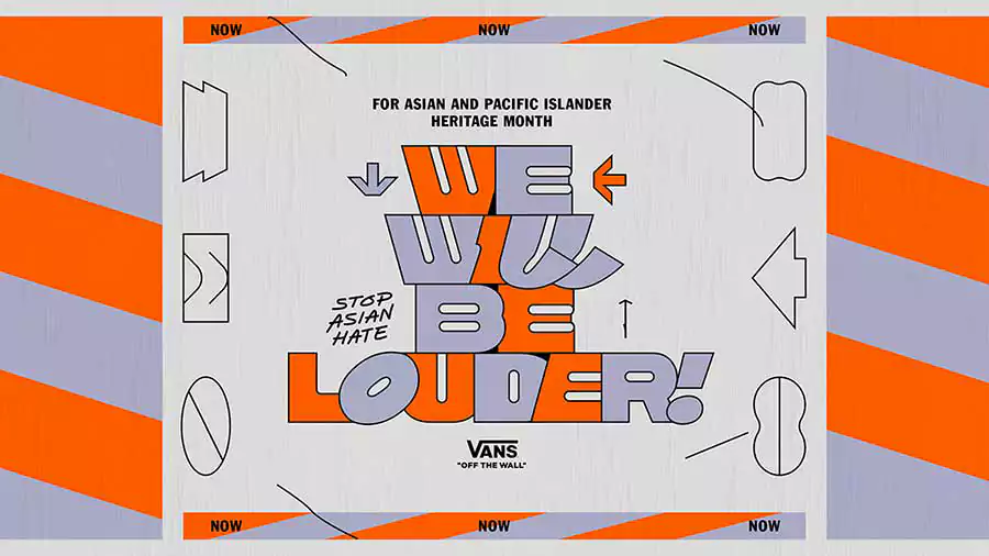
The graphic that you see here is an example of a design that was created for the shoe company Vans, and it shows their support for ending hate directed at Asians. The letters are packed closely together; nevertheless, some of them have an angle while others do not.
The letter O is slanted, and the Ls are drawn in a way that is unlike any Ls we have ever seen before. The colors shift dramatically from one letter to the next, and the entire design is framed on each side by geometric forms that don’t try to steal the spotlight but rather complement what’s already there.
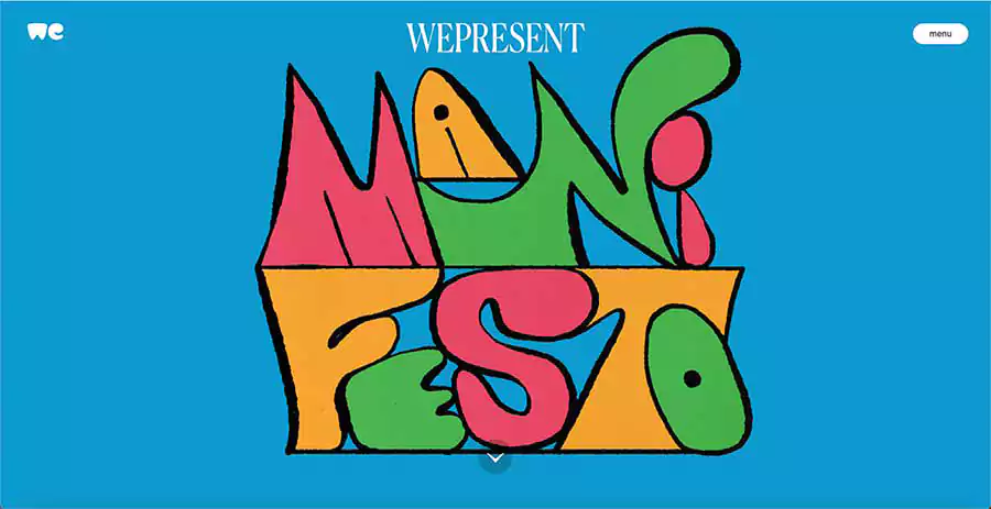
The typographic picture that can be found below, which was created by WePresent, is a wonderful example of unexpected typography.
In contrast to the example that was presented earlier, in which the typeface was altered to provide a new appearance, this design was created by hand, and each letter has its own distinct individuality. The impression is finished off by the way the letters are arranged in relation to one another.
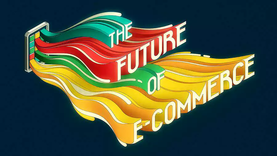
The sample that is shown below takes the recent trend of surprising typography to a new level by incorporating some psychedelic elements. The letters give the impression of emerging out of the portable device in order to communicate a message that is still extremely pertinent in today’s world and is titled “The Future of E-Commerce.” This is an excellent example that might be used in a post or article that you write.
07. The Development of 3D
Although the use of 3D in design has been prevalent for some time now, up until very recently, it was beyond reach for the average consumer brand. There was an abundance of 3D graphics, both static and animated varieties, in design communities and blogs.
But nowadays, 3D design is a lot easier to get into. Landing sites, infographics, presentations, and branding initiatives all make use of this design element. They may be found almost anywhere.
The illustration that is shown below goes beyond the 3D hands that are utilized by SaaS firms and instead depicts a human being in a bubbly 3D style, complete with a green beard and hair.
You can be confident that you will continue to see a great deal more designs using this particular style throughout the remainder of this year and into the next.
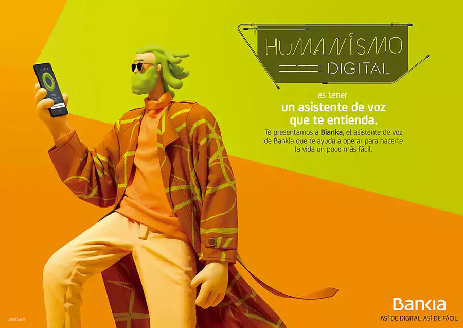
In the last section, I said that we are observing a trend toward 3D in landing pages. Companies are moving away from the human drawings used in the previous year and instead turning to 3D assets to depict the products and services associated with their brand.
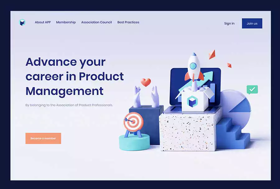
Visme gives you access to hundreds of 3D assets that may be used to create anything your business would want. From 3D images that are not animated to 3D forms and arrows that are animated. The Visme graphics collection is continuously expanding, and you can be certain that in the not-too-distant future, we will be releasing even more 3D elements.
Most Recent Article- Best Logo Fonts for Designer
08. Serifs Are Making a Comeback!
The first typeface to ever be utilized in the design process was the serif typeface. Calligraphy and hand-drawn type were the ancestors of this art form. By the way, a font is said to be serif if it has little protrusions that protrude forth from the lines that are running vertically and horizontally.
The use of serifs in headlines and titles, and even in branding in some instances, is becoming increasingly popular. In contrast to the trend of adopting sans serif typefaces a few years ago, an increasing number of companies are gravitating toward employing serif type.
The following example of a website design for a cosmetics company emphasizes the usage of serif fonts. Observe that the design of these series is rather traditional, but despite this, they nevertheless manage to seem contemporary and appealing. Did you also notice the emergence of geometric forms, as well as the subtle reference to sustainable practices and natural elements?
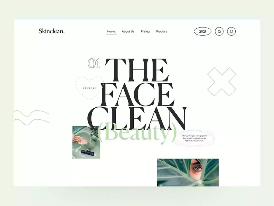
Both the primary headlines on the Mara Camps website as well as the logo that represents the Mara Camps brand were designed using serifs. What we are observing with this trend is that serif fonts are the focal point of the design; they are not only used as a body font; rather, they are a major character.
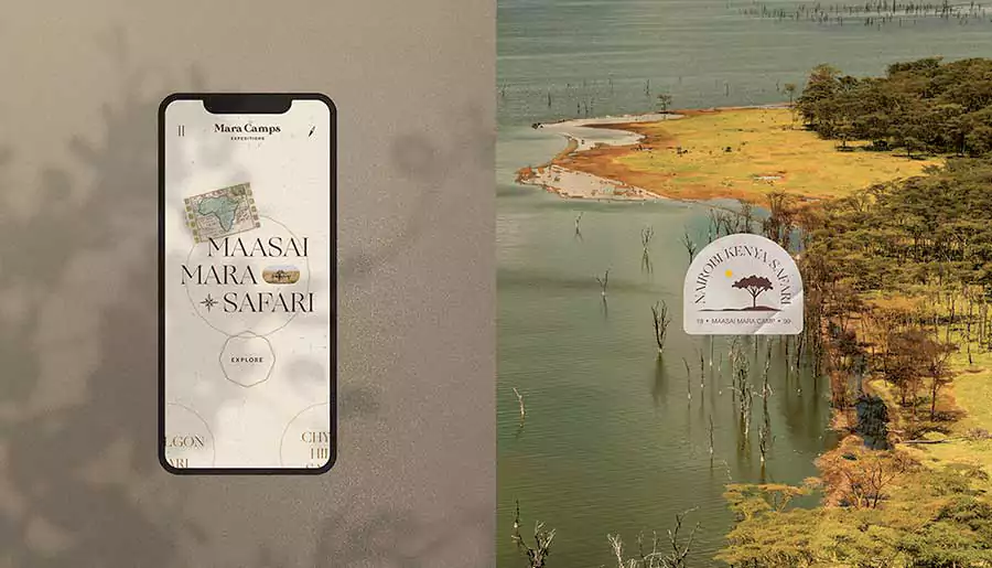
In this last illustration, for another beauty company, the design incorporates serifs in the essential titles as well as the brand assets. These series aren’t trying to be understated; they’re making a statement, and we can’t wait to watch which other designers start incorporating more serifs into their work.
Especially considering that the bulk of companies who once used serifs in their logos switched to sans serifs about two years ago.
Learn about the starting salary of a graphic designer.
09. Illustration Sets That Can Be Customized
Last but not least, the final trend in graphic design that we’ve identified for 2024 is one that we’re especially enthusiastic about. We just spoke about how there is a wider diversity of individuals being shown in illustrations, but this takes that tendency to an all-new level.
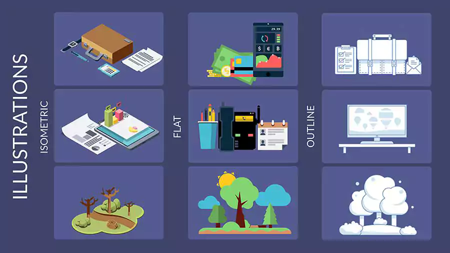
In this context, “illustration sets” refers not only to collections of individuals but also to collections of things and settings.
The first example is a website called Blush, which caters to all kinds of businesses and offers graphics in a wide variety of styles. All of them are modifiable using a variety of applications such as Adobe and Figma.
In addition, Blush provides on-site customization for more expedient outcomes. This is a premium service, however, there is a demo version that you may use for free.
The StorySet library that was developed by Freepik is another illustration of this tendency. These images may be altered to correspond with the aesthetic of any company. There are several sceneries available to pick from, each rendered in one of five different ways.
Since they are available for free with proper attribution, you have probably seen them in many other places. If you get a license from Freepik, you will be able to use their images without giving credit to the creator.
Final Thoughts
We hope that you found our rundown of graphic design trends for 2024 to be enjoyable. Here you can get an idea of a graphic design trend, which is called graphic design is my passion. Putting it all together for you was a fun and rewarding experience for us.
Our designers have ensured that examples of how any of these trends may be used with Visme have been created and provided. If you miss them, they are provided underneath each trend and may also be seen above.
Which one of these current trends do you like the most? The visuals and the three-dimensional components are ours to customize. We have been utilizing them for some time now, and it makes us glad to see that other manufacturers are beginning to include them in the designs of their products as well.
